Creating a calm and peaceful atmosphere in your home starts with choosing the right colors. Colors have a powerful impact on our mood and can influence how relaxed or energized we feel in a space. If you want your home to feel like a sanctuary of tranquility, selecting calm colors is essential. In this post, we’ll share helpful tips to guide you in choosing calming colors that suit your style and space.
Why Choose Calm Colors for Your Home?
Before diving into specific colors, it’s important to understand why calm colors matter. Calm colors tend to be soft, muted, and subtle rather than bold or bright. These colors can help reduce stress, promote relaxation, and create a soothing environment.
Homes painted with calm colors often feel more spacious and airy, and they provide a neutral backdrop where your furnishings and decorations can shine. Whether you want to refresh a living room, bedroom, or any other room, calm colors play a key role in making your space inviting and restful.
Popular Calm Colors and Their Effects
Here are some of the most common calm colors used in home decor and what they typically evoke:
– Soft Blues: Blue is known for its calming and serene quality. Light shades like sky blue or powder blue can remind you of the sky or water, creating a peaceful vibe.
– Muted Greens: Green connects us to nature and is associated with growth and renewal. Soft greens like sage or mint offer a fresh but relaxing feel.
– Warm Neutrals: Beige, taupe, and ivory provide warmth without overwhelming the senses. These colors are comforting and work well in almost any room.
– Pale Grays: Light gray is subtle and sophisticated, allowing other elements in the room to stand out while still maintaining a calm atmosphere.
– Lavender and Soft Purples: These hues add a gentle touch of color that feels peaceful and elegant without being too bold.
Tips for Choosing Calm Colors
1. Consider the Room’s Purpose
Think about how you use the room. Bedrooms and bathrooms benefit most from calming colors because these spaces are meant for relaxation. Living rooms and kitchens might handle slightly warmer calm shades, which can still be soothing but a bit more lively.
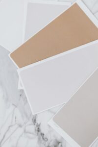
2. Use Color Samples at Different Times
Paint swatches can look very different under various lighting conditions. Test your color samples on walls and observe them in the morning, afternoon, and evening light before making a final decision.
3. Start with Neutral Bases
If you’re unsure, start with a neutral base color and add pops of calm color through decor items like cushions, rugs, or curtains. Neutral walls give flexibility and can adapt easily to changing trends or preferences.
4. Choose Matte or Satin Finishes
Glossy paints reflect more light and can feel less calming. Matte or satin finishes tend to create softer, more muted surfaces that enhance the calmness of color.
5. Balance Colors with Texture and Materials
Pair your calm colors with natural materials like wood, linen, or cotton. These textures add warmth and interest without detracting from the soothing vibe of your color scheme.
6. Limit High-Contrast Combinations
High contrast colors can be visually stimulating and disrupt the calm atmosphere. Try to keep color transitions smooth and harmonious, avoiding stark differences between walls and furniture.
7. Personalize Your Palette
What feels calm to one person may differ for another. Consider your own preferences and experiences. If a certain color brings you comfort or happiness, it’s worth including it in your home’s palette.
How to Apply Calm Colors Room by Room
Living Room
Choose soft blues or warm neutrals to create a welcoming space where family and friends gather. Add texture through throw blankets or curtains to enhance the cozy feel.
Bedroom
Opt for muted greens or pale grays to help promote restful sleep. Keep decor minimal and avoid bright, vibrant colors that can be too stimulating before bedtime.
Kitchen
Light colors like creamy whites or soft lavenders can keep the kitchen fresh and cheerful without feeling overwhelming. Pair with natural wood cabinetry for balance.
Bathroom
Soft blues and greens work well here, evoking the calming feel of water and nature. Use moisture-resistant paint and coordinate with light-colored towels and accessories.
Final Thoughts
Choosing calm colors for your home is a simple but effective way to create a peaceful environment. By considering the purpose of each room, testing colors in different light, and balancing hues with textures, you can design a space that feels restful and inviting. Remember, the best calm colors are the ones that make you feel comfortable and happy in your home.
Take your time experimenting and enjoy the process of turning your space into a tranquil retreat. Happy decorating!